
Tato
a tactile language for cooking
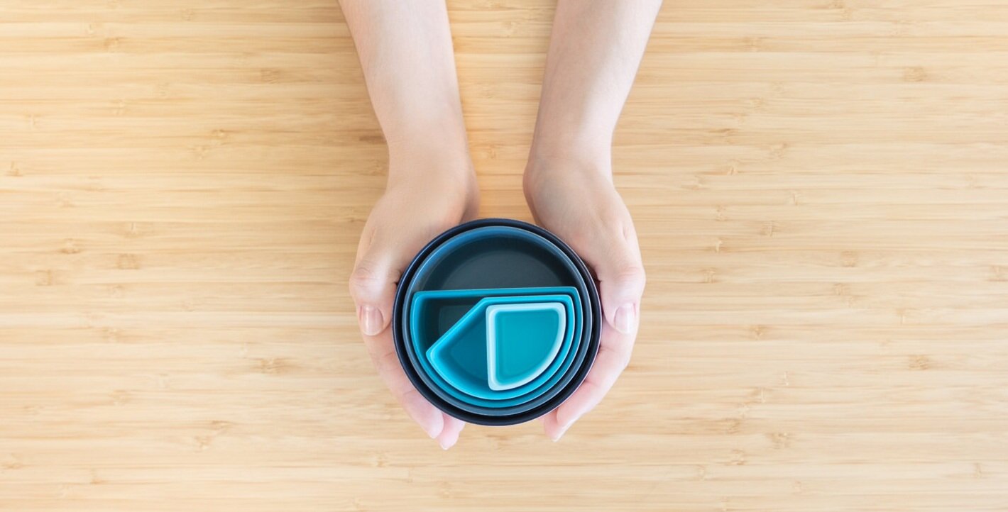
Tato is a measuring cup set designed in collaboration with the visually impaired. It uses the shapes of the fractions to tell the measurements and other tactile features for better user experience.
There are more than 7 million legally blind people in the US.
Most of them are adults in working age, but the employments rates and average salary are lower than the American average. Why?

“I have to ask for help when I go grocery shopping, when I
sort out pairs of socks and when I organize dollar bills in my
wallet. Independence is important to me, but it takes a lot of
training to get around life in a visual word.”
James, 28
Lawyer
Blind since 17 years old

"If you go blind or experience significant vision loss, learning
how to cook teaches you a lot of the skills you need to get
back into the world, be able to work and be independent”
Sydney, 55
Cooking instructor
Retinitis pigmentosa

Primary Research Insights
The visually impaired want independence, and the road to
independence can start with cooking.
There is a wide range of visual impairments, and they have
different needs.
There's a need for a language that can be understood with
both hands and eyes, no translation needed.
The paradigm that links blindness to a colorless life needs to
be broken. Color is not only about vision, it is also about
feeling.
Contrast is key to provide the best experience to the user.

Geometric language: tato uses the shapes of the fractions to convey the measurements of the cups.

Tato uses tactile cues to guide users while using. The pivot point works as support while pouring and the soft lip with hard edge provides optimal pouring surface from all sides.
Materials and Colors Research
A combination of function and feeling
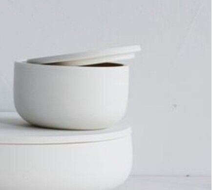
The users need a product that is sturdy and preferably won't break. It needs to be food safe, microwave safe and dishwasher safe. Because the contrast is so important, the material needs to take color well. The product also has fine details, and because of that it is important that the material can conform to the details with fidelity.
T A C T I L E D I S C O V E R Y A P P R O A C H A B L E C H A R A C T E R H O M E
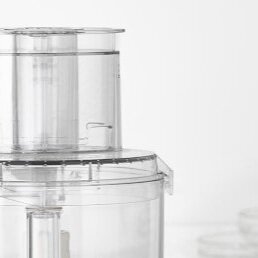


Polypropylene and Silicone
The cups would be made out of a polypropylene structure
overmolded with silicone. The materials fulfill all of the
functionality requirements and the silicone allows for a great
tactile experience for the grip and all of the fine details of the
design.
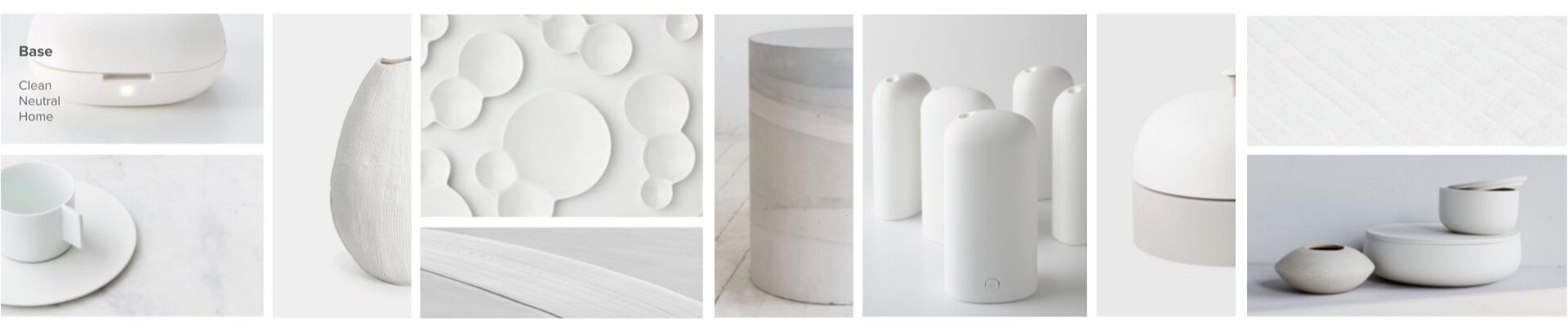
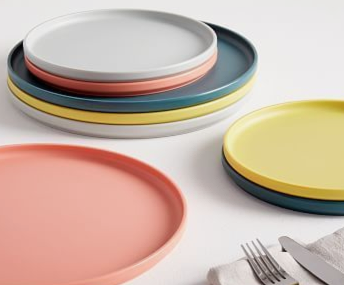
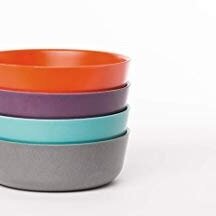
The measuring cups live in a home and should blend in. The base color is inspired neutral whites and light grays.
This color was chosen based on neutrality and cleanliness.


Inside the cups, there is a color pop, which brings in the idea of discovery, gives it character and makes the product more approachable. Besides that, the color also helps convey the shape of the fractions and create contrast between the ingredients and the measuring cup.
The blue theme was selected based on the contrast it creates with the ingredients, given that there are not natural ingredients that are blue.
Each cup has a slightly different tone, which helps the user distinguish them also based on color.

